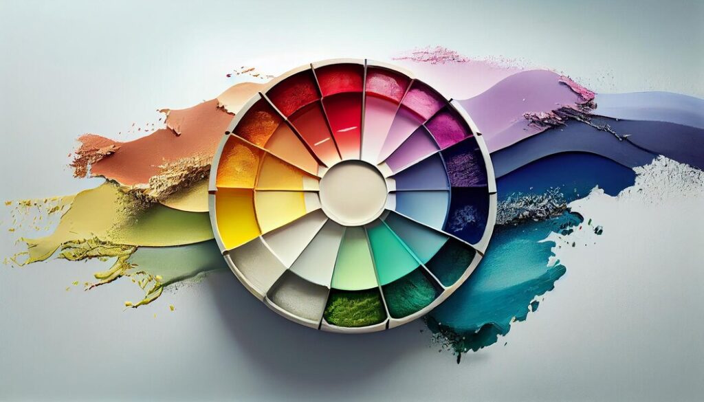
In today’s competitive marketplace, establishing a strong and recognizable brand is essential for success. And at the heart of every successful branding strategy lies the power of colours. Brand colours play a significant role in shaping consumer perceptions, establishing emotional connections, and ultimately driving conversions. Every colour choice carries psychological meaning, evokes specific emotions, and can influence how your target audience perceives your brand.
To truly master the art of branding, it is crucial to understand the psychology behind different colours and their impact on consumer behaviour. For example, while blue conveys trustworthiness and reliability, yellow signals optimism and energy. By strategically selecting brand colours that align with your business values and resonate with your target audience’s preferences, you can create a visual identity that instantly captures attention and fosters positive associations.
Moreover, consistent use of brand colours across all marketing channels contributes to building brand recognition. When customers repeatedly encounter familiar shades associated with your logo or packaging design, it creates subconscious associations with your products or services. These consistent visuals serve as visual cues that trigger immediate recognition—a critical factor in attracting prospects’ attention amidst competing brands vying for consumers’ limited attention spans.
Integrating brand colours seamlessly across marketing touchpoints, such as website designs, social media campaigns, packaging strategies, and advertisements, establishes a cohesive experience for customers. This emotional connection fosters loyalty, leading to customer retention, satisfaction, and repeat purchases.
In this comprehensive guide, we will provide further insights into mastering the art of integrating brand colours (colophons) into various marketing strategies (stratagems).
We’ll delve deeper into the psychology behind colour choices, discuss effective ways, and provide practical tips for choosing an ideal colour palette suited to your brand and target audience while making effective use of colour psychology.
We will also identify and provide detailed techniques for taking advantage of the selected brand colours from a conversion perspective.
Whether you’re a seasoned marketer or a business owner looking to enhance your branding efforts, this guide will equip you with the knowledge and strategies needed to propel your brand forward, delight customers, and drive tangible results. So let’s dive in and unlock the power of brand colours together!

Choosing an Ideal Colour Palette: Researching industry trends and competitive analysis

When selecting a colour palette for your brand, it’s crucial to stay informed about current industry trends and analyze what your competitors are doing.
This research will give you insights into the colours commonly associated with successful brands in your niche and help you identify any opportunities for differentiation.
By looking at your competitors’ colour choices, you can gain inspiration for creating a unique palette that not only stands out but also aligns with your target audience’s expectations.
Aligning with target audience preferences
Your brand colours should resonate with your target audience on an emotional level.
Understanding their preferences is key to choosing hues that capture their attention and establish a strong connection.
Consider conducting surveys or focus groups to gather feedback directly from potential customers.
Analyze their demographics, psychographics, interests, and behaviour patterns to determine which colours they are naturally drawn towards.
This information will guide you in selecting a colour palette that appeals to them while reflecting the essence of your brand.

Considering cultural implications when expanding globally

Expanding your business globally introduces additional considerations when it comes to choosing an ideal colour palette.
Different cultures associate different meanings with specific colours, so it’s essential to be mindful of these associations to avoid any unintended negative connotations or miscommunications across borders.
Conduct thorough research on the cultural significance of colours in each market you intend to enter; this will help ensure that the chosen colours convey positive messages and foster trust among diverse audiences around the world.
You may also be interested in reading: Unlocking Growth Potential: Maximizing Your Email Marketing Campaigns: Best Practices for 2023
Integrating Brand Colours Across Marketing Channels
Consistency is key when it comes to branding, and one of the most effective ways to maintain a cohesive brand identity across different marketing channels is through the strategic integration of brand colours. From website design to social media graphics and email marketing templates, every touchpoint with your target audience offers an opportunity to reinforce your brand’s visual identity.
When it comes to website design, it’s crucial to adhere to specific guidelines that ensure consistency in branding. Start by using your primary brand colour as the dominant hue throughout your website. This will create a sense of familiarity for visitors and help them associate certain emotions or qualities with your brand. Additionally, incorporating secondary colours that complement your primary shade can add depth and visual interest without overwhelming the user experience.

In today’s digitally-driven world, social media has become an indispensable tool for marketers. To effectively integrate brand colours into social media graphics and content creation efforts, prioritize keeping visuals consistent across platforms while adapting them to each unique format. For example, use branded templates with consistent typography styles and colour schemes so that even at a glance, viewers recognise which posts belong to your company.
Email marketing remains one of the most powerful tools for nurturing leads and driving conversions – don’t miss out on integrating brand colours here too! Incorporate your chosen palette into email templates by selecting backgrounds, fonts, buttons, headers/footers that align seamlessly with your overall branding strategy. By consistently reinforcing these hues across newsletters or promotional emails; you’ll increase recognition from recipients who associate those distinct shades with your offerings over time.
Remember: consistency breeds recognition, and strategically integrating brand colours into all of your marketing channels – including design, social media content creation, and email marketing- will solidify your ownership of those particular ones. Whether your goal is to connect with eager prospects on social media or convert potential customers into loyal supporters via email, it begins with adhering to your brand’s distinctive visual identity.
You may also be interested in reading: Unlocking Growth Potential: The Benefits of YouTube Ads for Direct-To-Consumer e-Commerce Brands
Creating Visual Hierarchy using Brand Colours

One of the most important aspects of integrating brand colours into your marketing strategy is creating a visual hierarchy.
This involves strategically using contrasting elements to guide the viewer’s eye and prioritize information.
Incorporating contrasting colours not only enhances the readability of your marketing materials but also adds visual interest.
For example, you can use a darker shade for headlines or key messages and pair it with a lighter background colour to ensure that these elements stand out instantly.
Another effective way to highlight key messages visually is by utilizing vibrant tones. Vibrant and bold colours naturally draw attention, making them ideal for emphasizing important information such as calls to action or special offers. By strategically incorporating these vibrant tones in relevant places throughout your marketing collateral, you can create a strong visual impact that grabs the viewer’s attention and drives action.
When selecting brand colours for your marketing materials, it is essential to consider accessibility standards. Ensuring appropriate contrasts between text and background colours helps individuals with visual impairments navigate your content easily. Additionally, meeting accessibility standards demonstrates inclusivity and reinforces positive brand value among diverse audiences.
By carefully considering contrast levels when integrating brand colours into various aspects of your marketing strategy, you can effectively create a visual hierarchy that guides viewers’ focus towards essential information while maintaining readability and inclusivity standards.
You may also be interested in reading: Should SMAs opt for Influencer Marketing?
Enhancing Conversion Rates Through Strategic Colour Choices
Colour plays a crucial role in influencing consumer behaviour and can significantly impact conversion rates.
By strategically choosing the right colours for your brand, you can create a visual identity that resonates with your target audience and compels them to take action.

Utilizing colour psychology to influence consumer behaviour

Colour psychology is the study of how different hues affect human emotions, perceptions, and behaviours.
Understanding the psychological associations with each colour can help you select colours that align with your brand values and elicit specific responses from consumers.
For example, blue is often associated with trustworthiness and reliability, making it a popular choice for financial institutions aiming to build credibility.
On the other hand, red evokes feelings of urgency or excitement, making it effective for creating a sense of urgency in sales promotions (University of South California, 2023).
Applying A/B testing for optimal results
To ensure the effectiveness of your chosen colours in driving conversions, it’s essential to conduct A/B testing.
This involves presenting different versions of marketing materials or website designs using alternate colour schemes to determine which one performs better.
Through this process, you can collect data on user engagement metrics such as click-through rates or conversion rates and make data-driven decisions about which colours are most successful at converting leads.

Case studies on successful conversion-driven colour strategies

Several brands have successfully implemented strategic colour choices to enhance their conversion rates. For instance, eCommerce giant Amazon uses an orange Add to Cart button strategically placed against its blue background colour scheme — this contrast draws attention directly towards the call-to-action button resulting in higher conversion rates. Additionally, Zappos changed its CTA text buttons’ colours from black (which blended into surrounding text) to bright green—an eye-catching shade associated with positivity—to improve its customers’ checkout experience (Suleman, 2023).
Mastering the art of integrating brand colours effectively requires both creativity and scientific understanding behind audience preference patterns as well as an ongoing commitment to performance tracking through techniques like A/B testing. By following these strategies and studying successful case studies, you can optimize your brand colours to drive conversions and ultimately propel your business forward.
Maintaining Consistency Over Time and Channels

Creating a strong brand identity involves more than just selecting the right colours; it requires consistency in how these colours are used across different platforms and over time. One effective way to achieve this is by developing comprehensive brand guidelines that outline how employees and partners should use the brand colours in their marketing materials.
Brand guidelines serve as a reference point for everyone involved with your brand, ensuring that there is a unified approach to using brand colours. These guidelines should include details such as the exact values or codes of each colour in the palette, how they should be used together, and any restrictions on their usage. By providing clear instructions on everything from logo placement to typography choices, you can ensure that your branding remains consistent no matter who is creating content.
However, merely creating brand guidelines isn’t enough – regular audits are essential to maintaining consistency over time. Conducting periodic reviews of all marketing materials will help identify any deviations from the established guidelines so they can be corrected promptly. This proactive approach ensures that even subtle inconsistencies don’t go unnoticed, preventing the dilution of your branding efforts.
Evaluating feedback from customers and stakeholders also plays a crucial role in maintaining consistency. Keep an open line of communication with those who interact with your brand regularly — both online through social media channels or offline through customer service interactions — and listen attentively to their opinions about how you’re presenting your brand visually. Use this feedback constructively to make necessary adjustments or improvements while staying true to your core branding elements.
By maintaining consistency over time and across various marketing channels, businesses can effectively reinforce their branding efforts while building trust among consumers by providing them with recognisable experiences.
References:
- Suleman, A. (2023). Modern Psychology of CTA Buttons for Retail Websites. ZillionDesigns. Retrieved January 3, 2024, from https://www.zilliondesigns.com/blog/modern-psychology-call-to-action-buttons-retail-websites/
- University of South California. (2023, November 17). Color Psychology: See the Value for Marketing | USC MAPP Online. A master’s degree in applied psychology. Retrieved January 3, 2024, from https://appliedpsychologydegree.usc.edu/blog/color-psychology-used-in-marketing-an-overview


